Classy vs Bright Signage Guide
Compare soft white, backlit, and bright signage illumination to see which lighting style best fits your brand and customer demographics.
Classy vs. Bright Signage: Which Illumination Fits Your Brand?
Many brands choose signage illumination based on one simple goal: visibility. If it is bright enough to be seen from the road, the job feels done. The problem is that illumination does far more than make a sign readable. Lighting style directly influences how people perceive your brand, who feels invited inside, and what expectations customers carry before they ever open the door.
Illumination communicates tone, quality, and positioning in seconds.
Let’s look at three common illumination approaches used in commercial signage today. Soft white facials, controlled backlit illumination, and bright illumination. By understanding how each style works and where it performs best, you can make more informed decisions that support both visibility and brand perception.
Soft White Facials for Premium Brand Positioning
Soft white facial illumination is often associated with brands that want to project refinement, confidence, and restraint. Instead of overpowering the storefront with light, this approach uses balanced, warm-to-neutral white LEDs that evenly wash the sign face.
Brands like Fabletics and Neiman Marcus use soft white illumination to reinforce their premium positioning. The light is intentional, controlled, and consistent. It allows materials, typography, and architectural elements to stand out without visual noise.
Why soft white works for upscale brands
Soft white facial illumination supports a brand narrative that says quality over quantity. It signals that the brand does not need to shout to be noticed. This approach tends to resonate with customers who value experience, aesthetics, and trust.
Key benefits include:
- A refined nighttime appearance that complements upscale architecture
- Reduced glare and visual fatigue for pedestrians and drivers
- Strong alignment with premium pricing and curated retail environments
Soft white illumination is especially effective in lifestyle centers, urban retail corridors, and mixed use developments where brand harmony matters as much as visibility.
For brands focused on long term equity rather than impulse traffic, this lighting style reinforces consistency and confidence.
Backlit Illumination That Adds Depth Without Overpowering
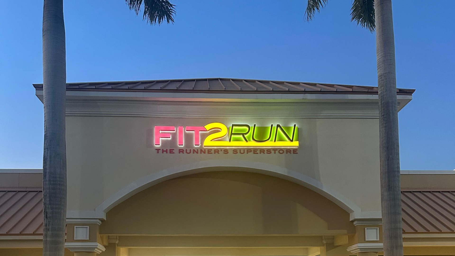
Backlit illumination is often misunderstood as simply another form of brightness. In reality, controlled backlighting is about depth, dimension, and subtle emphasis. Light is emitted from behind the sign elements, creating a halo or glow effect that separates the brand from the building surface.
When executed properly, backlit signage adds sophistication without overwhelming the storefront. It draws the eye while maintaining balance with the surrounding architecture.
Why controlled backlighting elevates storefronts
Backlit illumination creates contrast instead of intensity. The eye is naturally drawn to edges and negative space, which makes this style feel intentional and modern.
Advantages of backlit signage include:
- Enhanced dimensionality that adds visual interest at night
- Cleaner sightlines that keep focus on the brand mark
- A premium look without excessive brightness
This approach is popular among boutique retailers, fitness studios, and brands that want a contemporary aesthetic without mass market cues. It pairs well with architectural facades, textured materials, and minimalist brand systems.
If you are designing signage as part of a broader storefront experience rather than a standalone element, backlit illumination often delivers the best balance of presence and restraint.
Bright Illumination for Energy, Urgency, and Mass Appeal
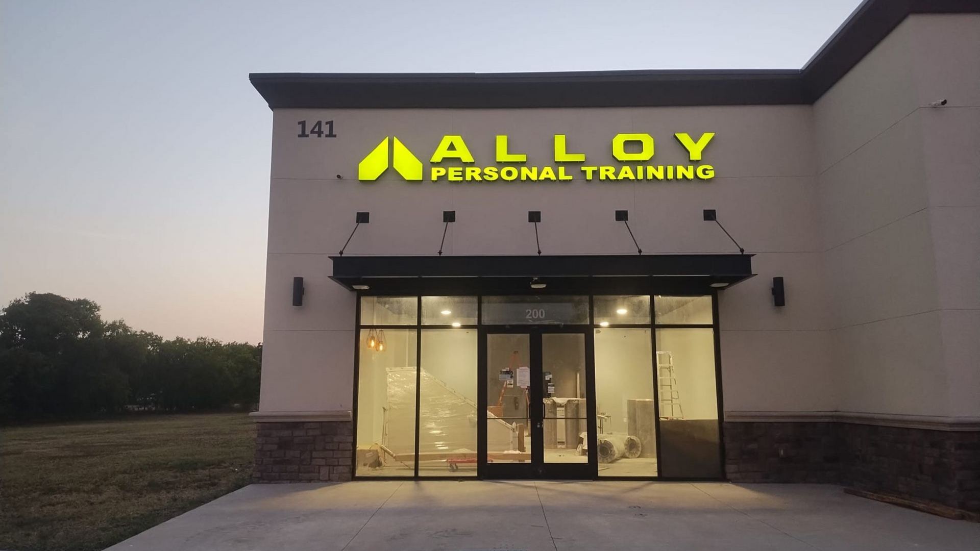
Bright illumination plays a very different role in brand communication. High output lighting is designed to cut through visual clutter, grab attention quickly, and create a sense of energy.
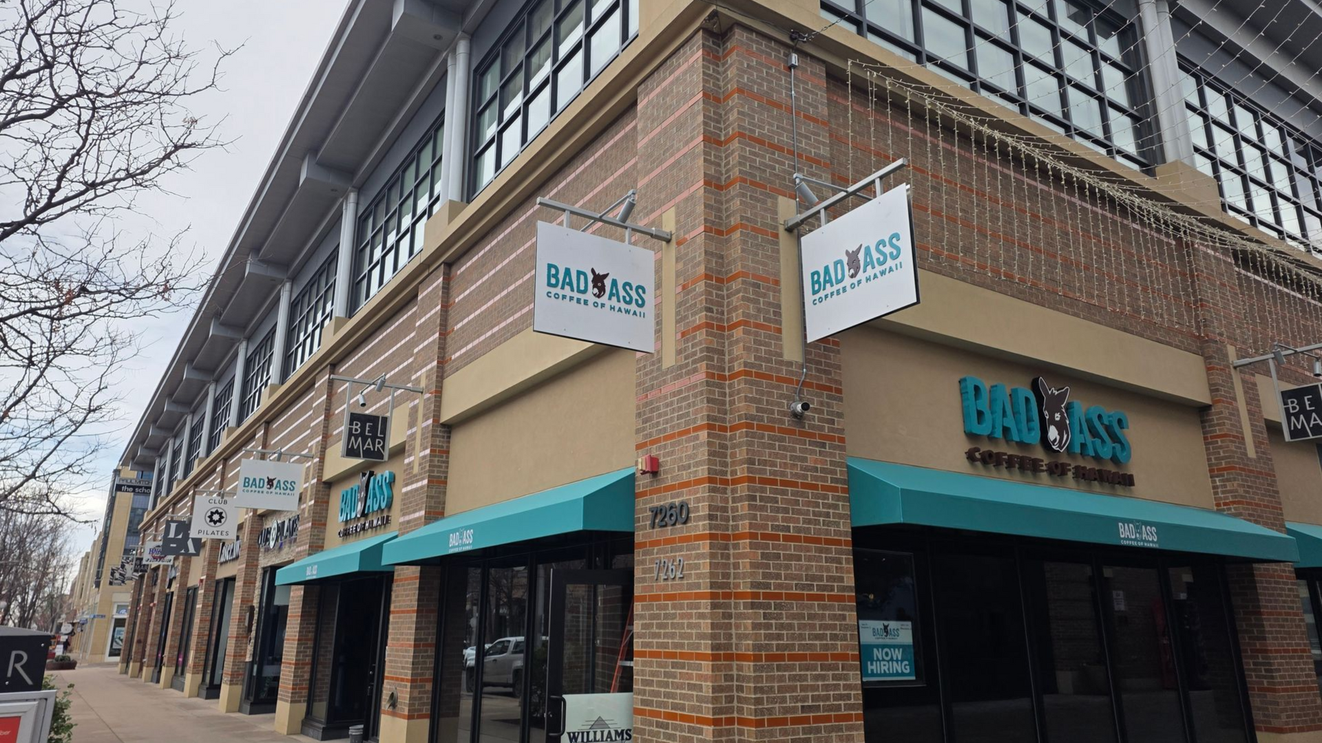
Brands like Bath & Body Works rely on brightness to support high-traffic retail environments. The illumination is bold, immediate, and unmistakable. It signals accessibility, movement, and frequent promotions.
When brightness supports brand goals
Bright signage is not accidental. It is a strategic choice that aligns with volume-driven retail models and broad demographic appeal.
Common benefits include:
- Maximum visibility in crowded shopping centers
- Strong performance during peak hours and promotional cycles
- Clear communication of energy, affordability, and availability
This style works particularly well for brands that thrive on impulse visits, seasonal campaigns, and high customer turnover. In these environments, being seen first often matters more than subtlety.
According to retail visibility research summarized by Retail Design Institute, high contrast and brightness can significantly increase storefront recognition in competitive corridors, especially in evening hours.
The key is intentional control. Bright does not mean careless. Proper spacing, color temperature, and consistency prevent the storefront from feeling chaotic or dated.
Choosing Illumination Based on Brand Strategy, Not Just Visibility
The most common mistake in signage illumination is treating brightness as a default setting rather than a design decision. Visibility matters, but it is only one part of the equation.
When evaluating illumination styles, brands should consider:
- Target customer demographics and buying behavior
- Price point and perceived value
- Surrounding tenants and architectural context
- Long term brand equity versus short term traffic
A premium brand using overly bright signage can unintentionally dilute its positioning. A mass market brand using subdued illumination may struggle to compete for attention. The right solution is rarely universal. It is contextual.
This is where experienced signage partners add value. Illumination standards should be developed alongside brand guidelines, not after the fact.
If you are planning a new buildout or refreshing an existing location, reviewing illumination choices early can prevent costly revisions and misalignment down the road.
Align Your Illumination With Your Brand
Illumination is one of the most powerful brand signals on your storefront. It shapes first impressions, influences foot traffic, and communicates who your brand is for before a customer ever walks inside.
Whether your brand calls for refined soft white facials, architectural backlit illumination, or bold bright lighting, the decision should support your overall strategy.
Connect with National Sign Team to evaluate illumination standards that align with your brand strategy. Our team works with national and multi site brands to ensure signage lighting supports both visibility and perception.
Start the conversation by visiting our commercial signage services page or contact our team directly through our consultation request form.
The right illumination does more than light up your sign. It tells your brand story clearly, consistently, and confidently.
