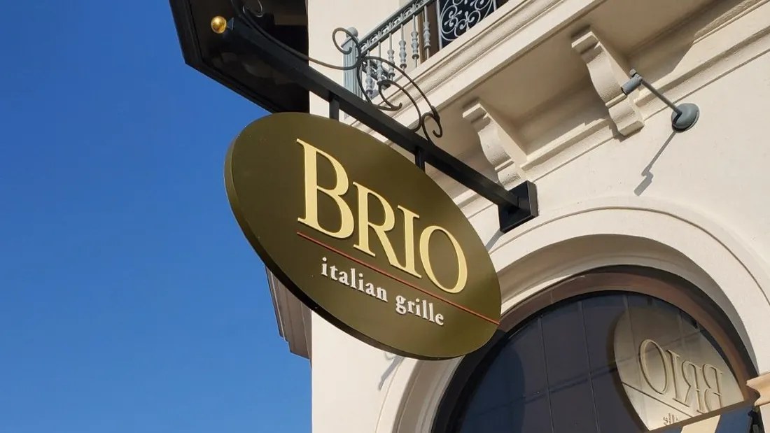
Most blade signs get a single glance. Someone's walking down the sidewalk, looks up, and either finds your name or keeps going.
That glance is the whole design brief. Your wall sign is built to be read from the parking lot or across the street. Your blade sign is read by people already on foot, at an angle, often from almost underneath it.
Here's what separates the blade signs people notice from the ones they walk under.
Start with one thing to read
The most common blade sign mistake is trying to fit the wall sign onto it: tagline, phone number, website, a list of services. On a panel a fraction of the size of your wall sign, all of that turns into clutter nobody can read at walking pace.
Pick one thing. Usually that's your logo or your name. If your brand has a mark people already recognize, like the Burton mountain or the Hard Rock roundel, the mark alone can carry the sign.
Design for the angle
People rarely see a blade sign straight on. They see it while walking toward it, reading from below and to the side, until they're nearly under it. That changes a few decisions:
Go bold
Heavy letterforms and simple marks hold up at an angle. Fine script and hairline strokes disappear.
Push the contrast
Dark on light or light on dark reads from much farther away than two mid-tones that look great on a screen.
Finish the edge
At an angle, people see the side of the sign almost as much as the face. A deeper cabinet or a clean, finished edge looks deliberate from the sidewalk.
Check both faces
Most blade signs are double-sided because people approach from both directions. Make sure the second face reads correctly, especially if your logo has lettering that can't simply be mirrored.
Size it to the street
Bigger isn't automatically better. A blade sign that's too large for the facade looks like it was meant for a different building, and it's more likely to run into your city's size limits.
The right size comes from three things:
- What your city allows for projecting signs
- What the facade and the wall behind it can support
- How far away people need to read it, which on a busy downtown sidewalk is a lot closer than on a road with fast traffic
Code usually sets the ceiling. The storefront and the sight lines decide where you land under it.
Put it where people are already looking
Placement does as much work as design. A great blade sign hidden behind a street tree won't get read.
- Mount it close to your entrance, so the sign and the door read as one thing
- Keep it clear of trees, awnings, light poles and neighboring signs
- Hang it high enough to clear the sidewalk comfortably and low enough to stay in the eye line of someone on foot
- In covered walkways, hang it under the canopy, where shoppers can actually see it
A site survey answers most of this before anyone draws anything. Photos from the sidewalk, taken in both directions, tell you more about placement than an elevation drawing will.
Treat the bracket as part of the design
The bracket is the first thing to get value-engineered and the first thing people notice when it's wrong. A decorative scroll bracket says something different from a clean steel arm, and both say something different from a sign hung on chains.
Match it to the building and the brand. The Brio blade signs hang from ornate black scrollwork that suits the restaurants' architecture. The Burton signs use simple black arms that disappear against brick and let the mountain logo do the work.
Plan the lighting from the start
If you're open after dark, decide on lighting before the design is final. It changes how the sign is built, the electrical work at the wall, and sometimes the permit.
Your main options:
Internally lit
LEDs inside the cabinet light the face, or just the logo and letters.
Halo lit
Letters or a logo stand off the face with light glowing behind them.
Externally lit
A fixture aimed at the sign, which suits historic districts and traditional designs.
Non-illuminated
Clean and economical for daytime businesses, or districts that limit lighting.
Some districts restrict internally lit signs, so check before you fall in love with a design.
Keep it consistent across locations
For a multi-location brand, the blade sign is often where consistency breaks first. Every city sets its own limits, so one location ends up with a smaller sign, another with a different bracket, and a third with whatever the local shop had on hand.
The answer is a design standard built for variation. One approved design comes with defined sizes, mounting options and lighting versions, so each site can be adapted to its code without drifting from the brand. That's how we handle blade signs in our multi-site signage programs, with one project manager tracking every location.
A quick checklist
Before you approve a blade sign design, make sure it:
All seven check out. That design is ready to approve, and ready to repeat at the next location.
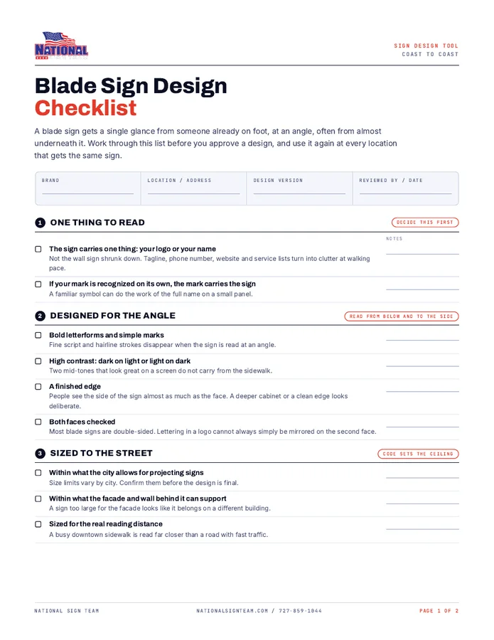
Take the checklist to the sidewalk
This list as a two-page printable PDF, with a checkbox and a notes line for every item, the four lighting options side by side, and a sign-off block you can reuse at every location.
- Design, angle and sizing checks
- Placement, bracket and lighting checks
- Notes line on every item
- A sign-off block for each location
Where should we send it?
Add your name and email and the download starts straight away.
Planning blade signs?
Send us your locations and a few photos of each facade. We'll come back with a design, the permitting picture for each address and a per-site cost breakdown. You can also see the options for custom blade signs, from illuminated to under-canopy.